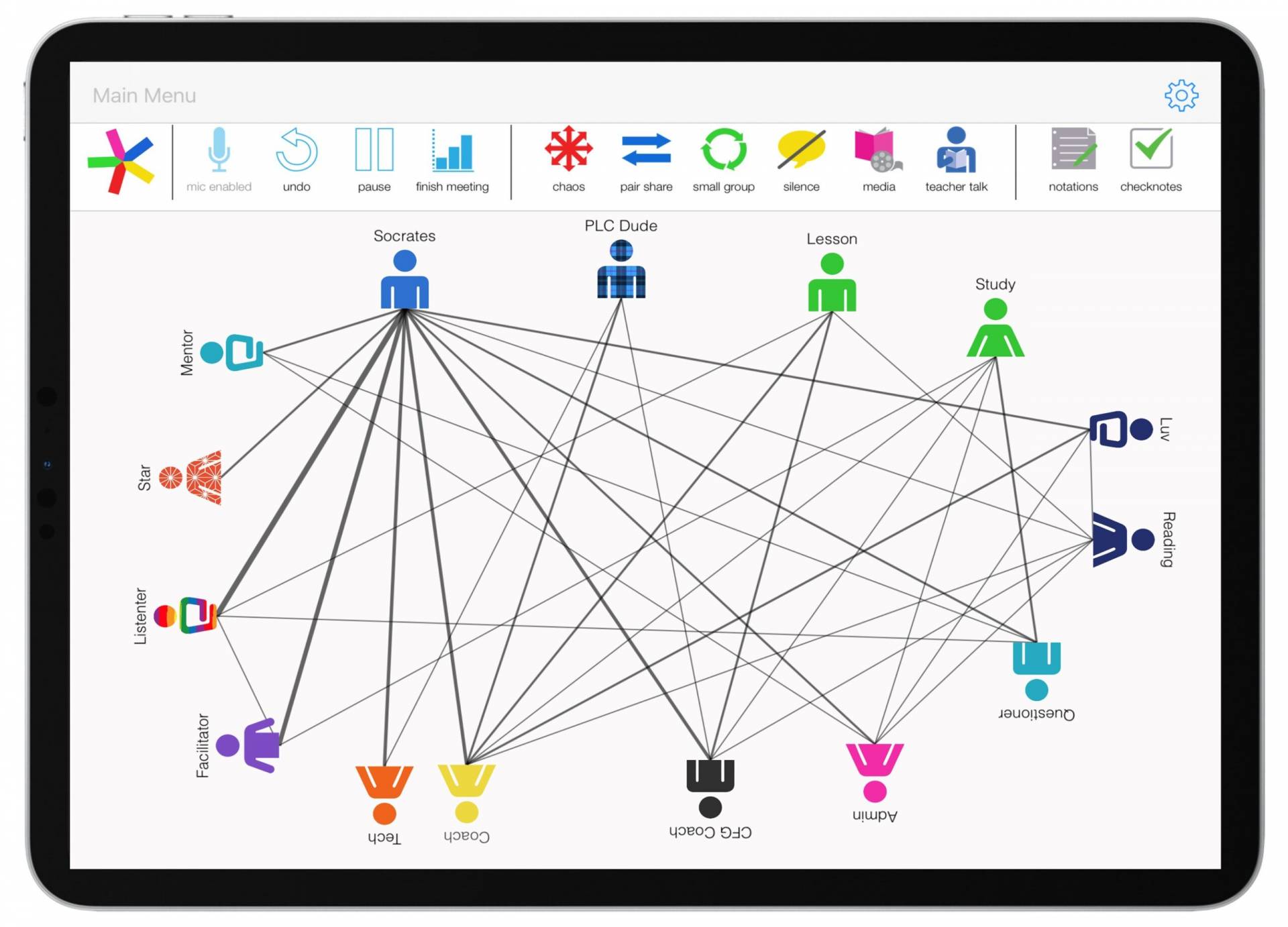
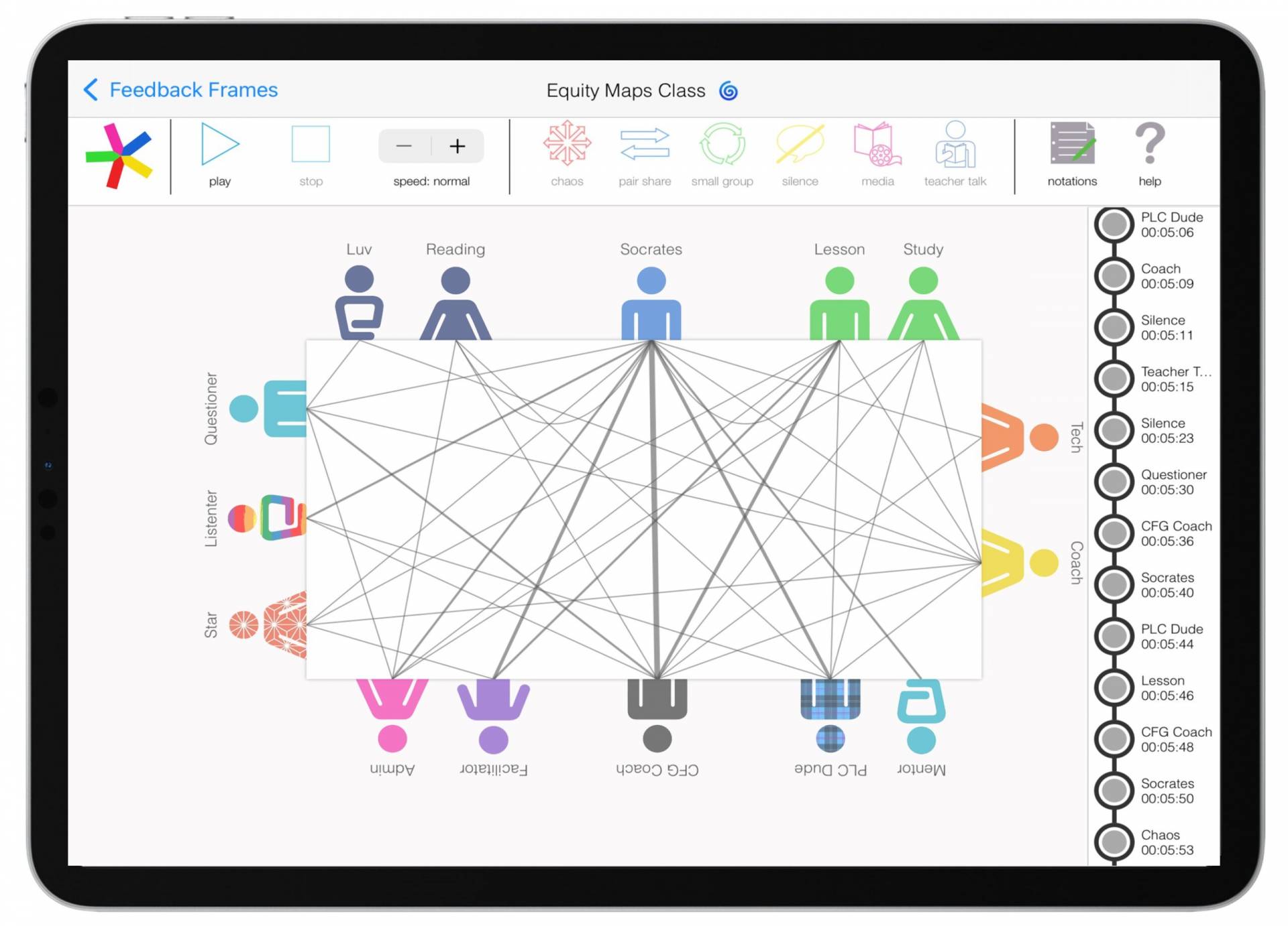

Available on the iPad -- No subscription required ! v.6.0
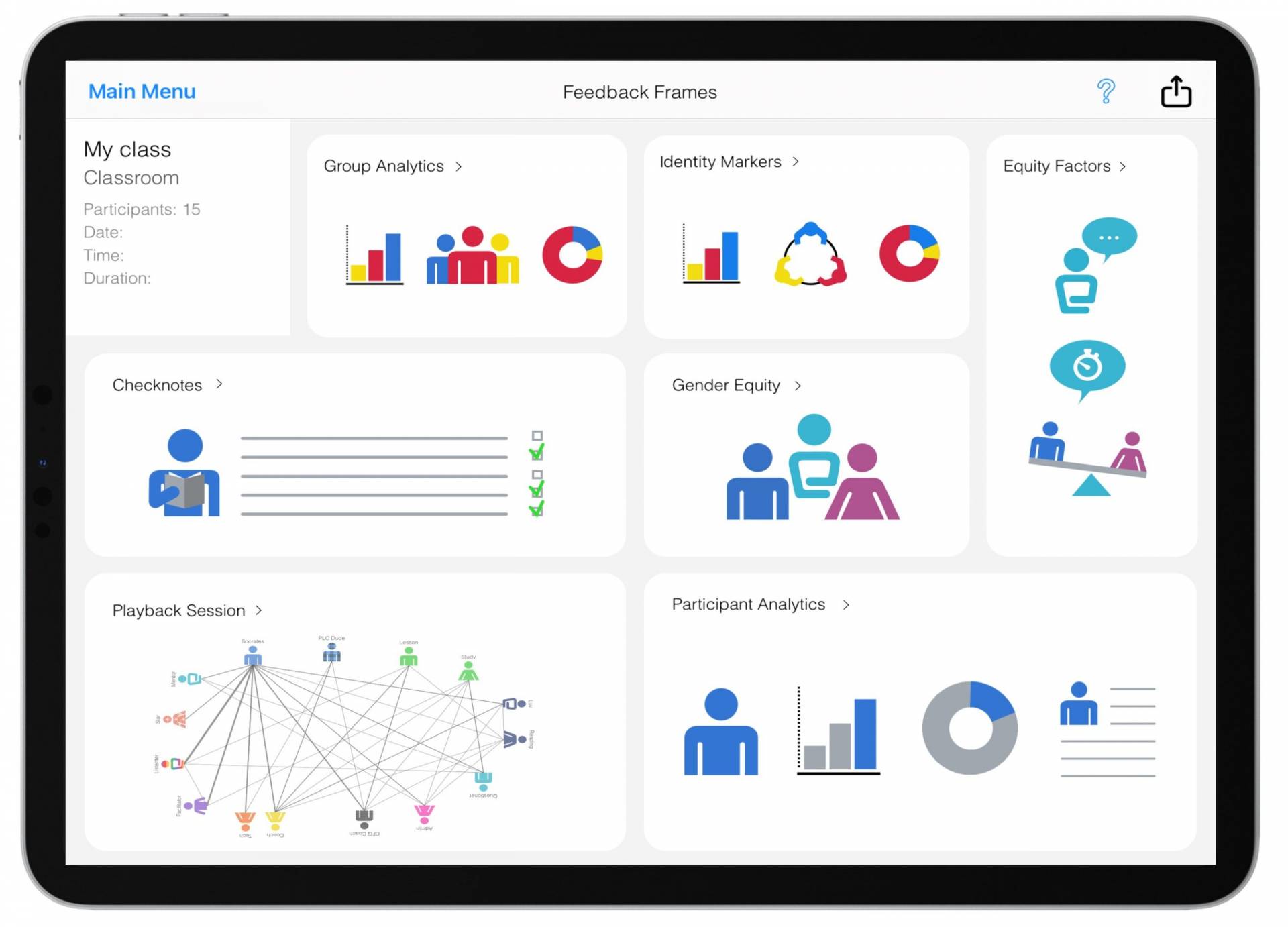
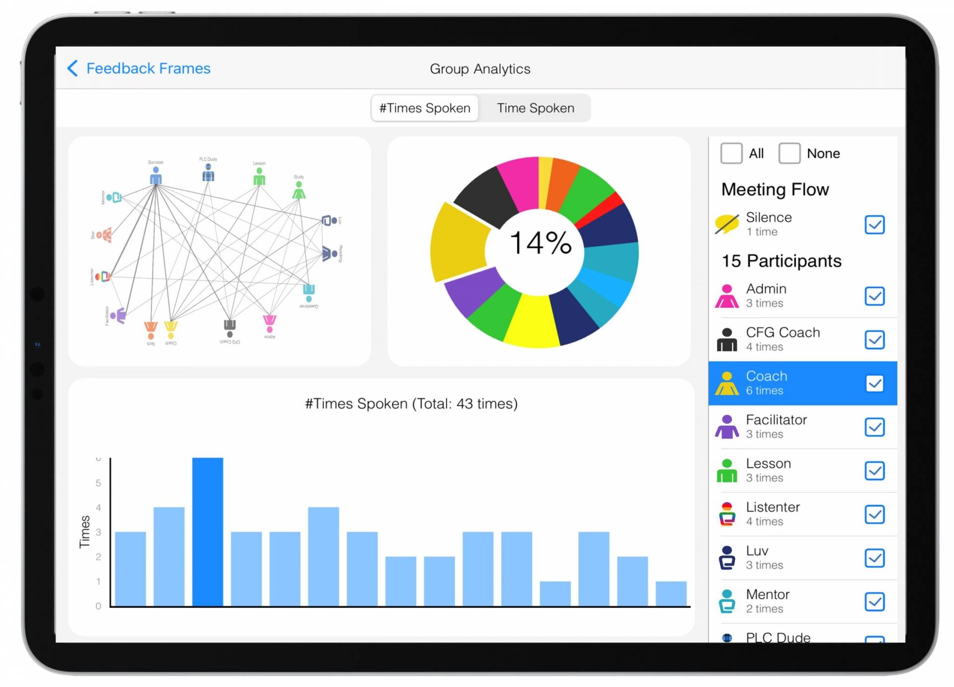
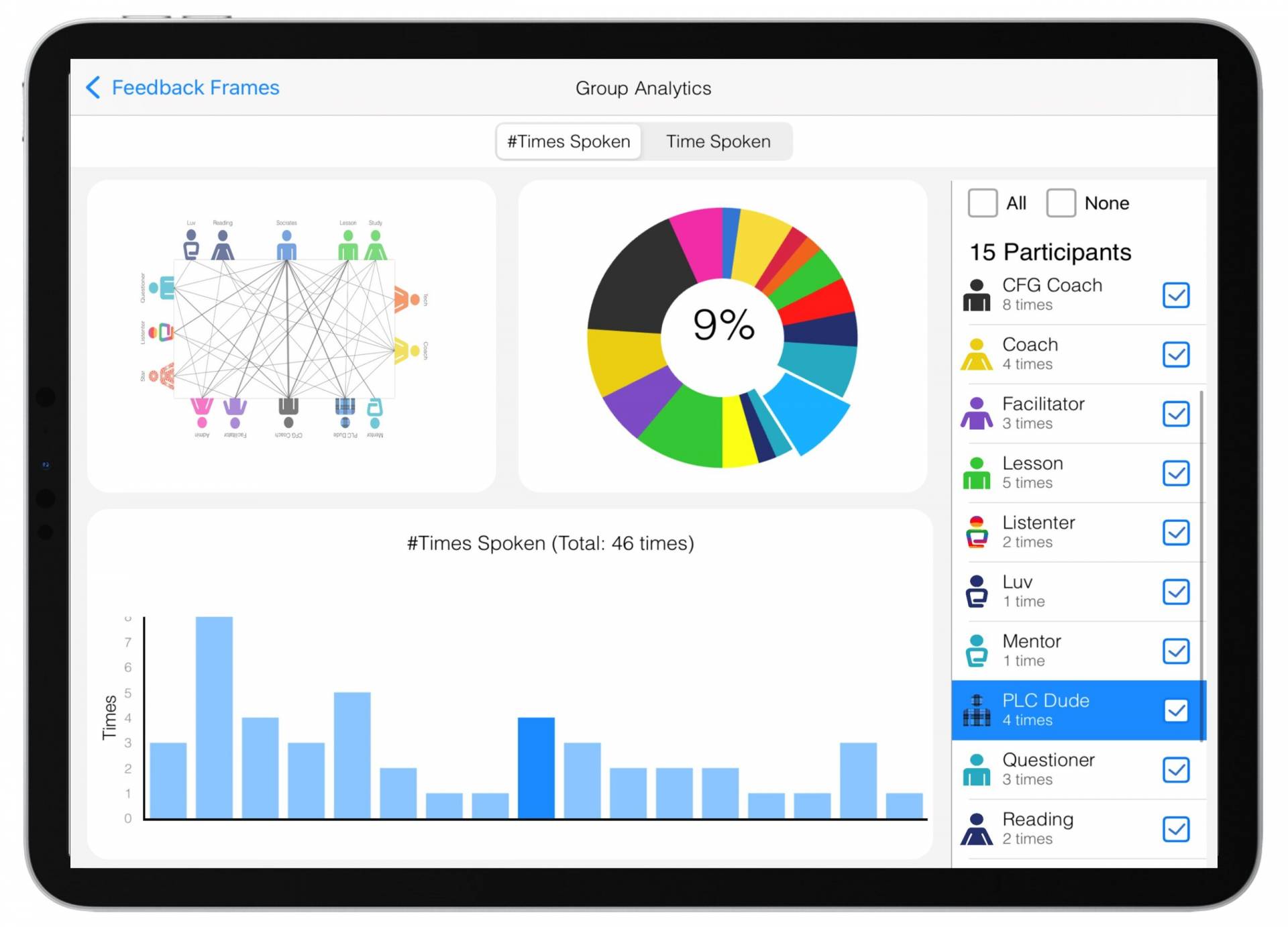
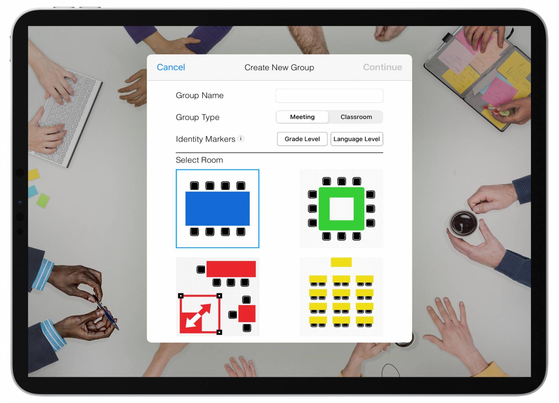
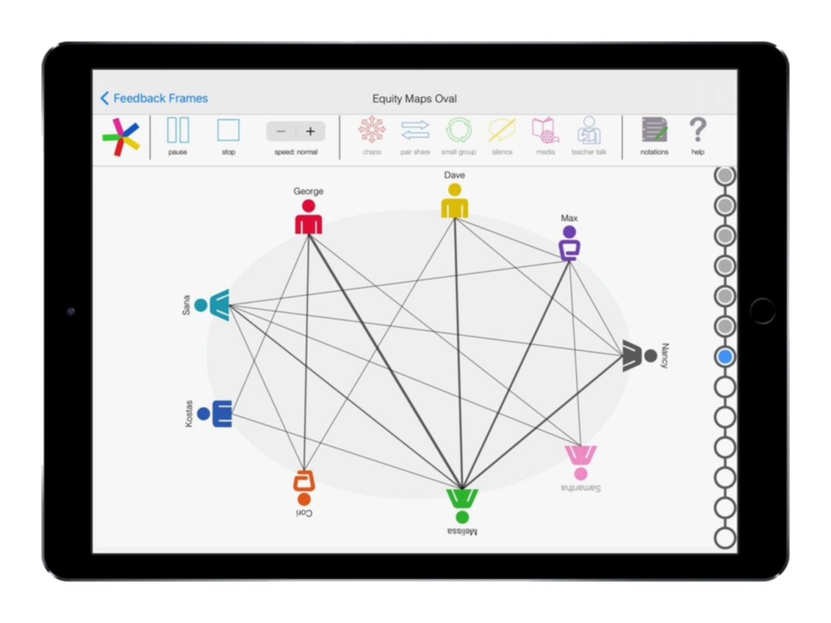
Map up to 40 Participants at a time - Instant Feedback
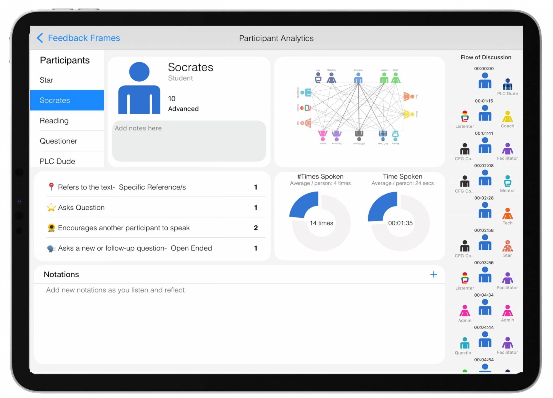
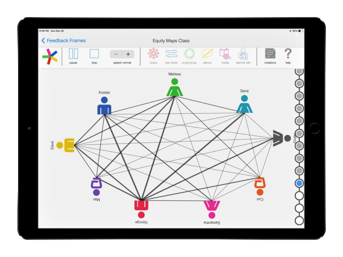
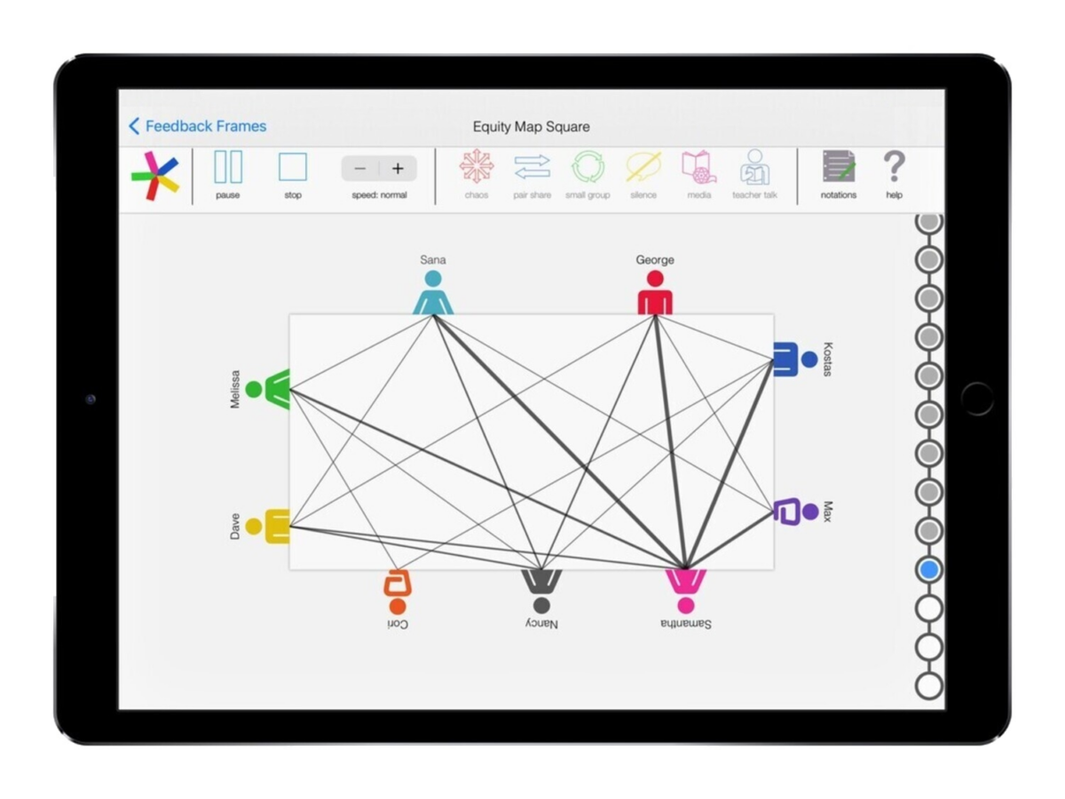
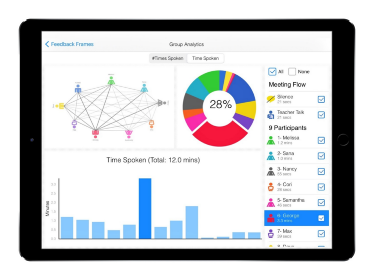
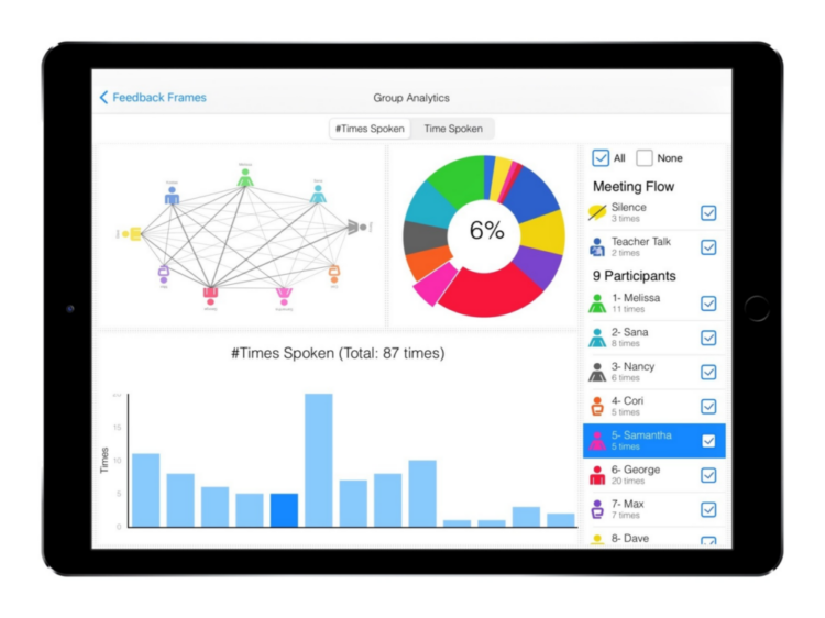
Listen to entire discussion or listen by student
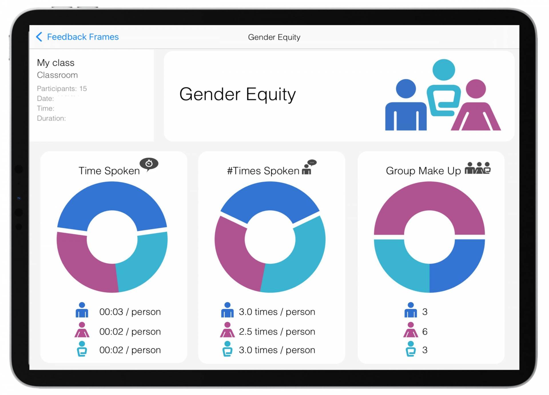
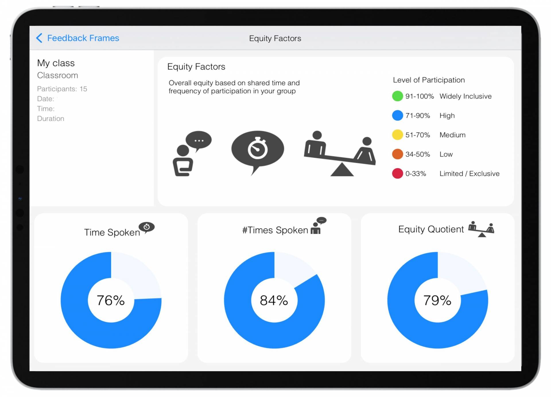
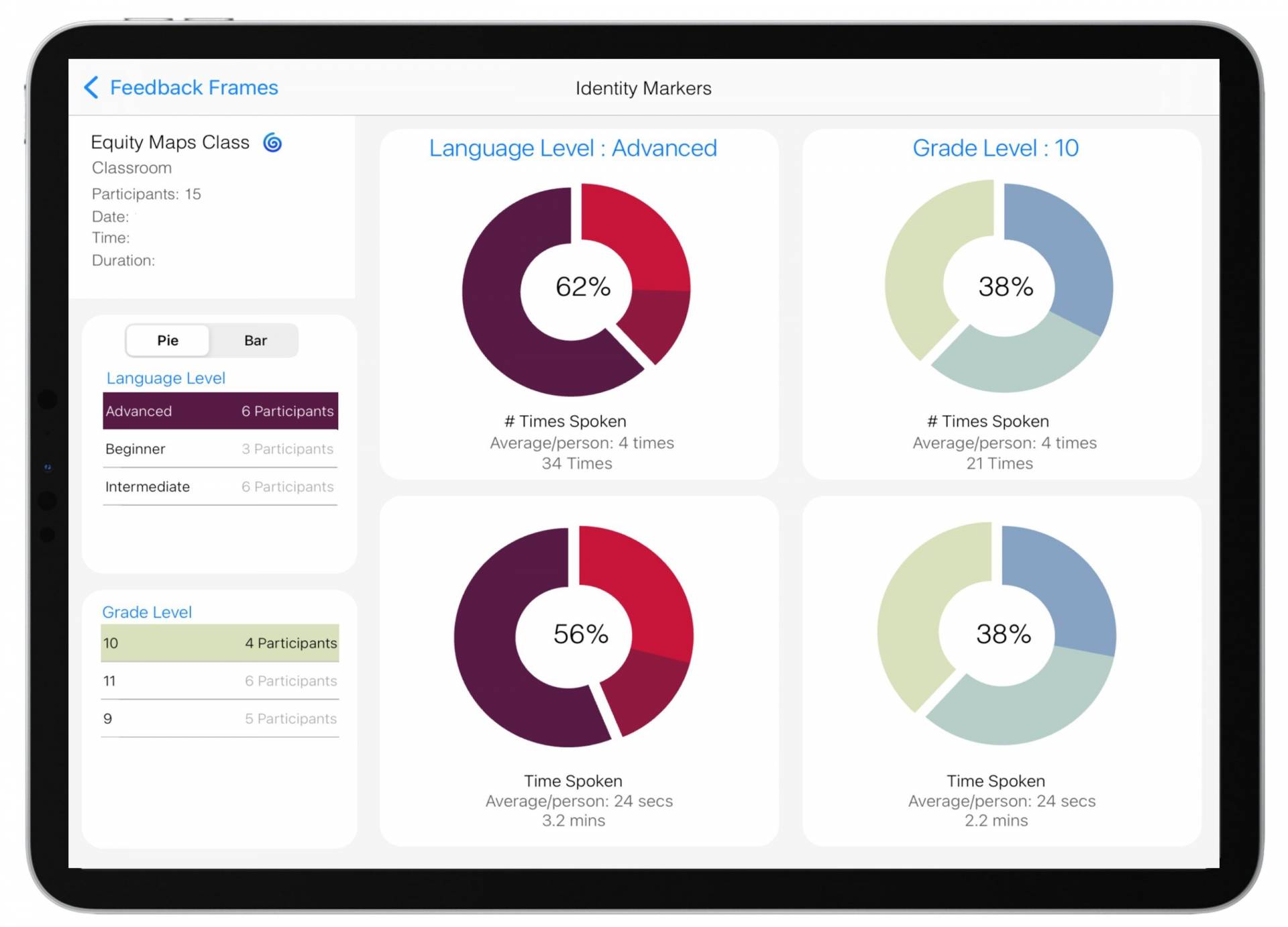
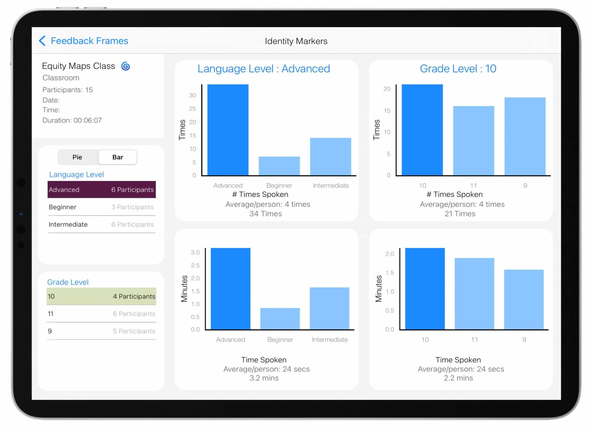
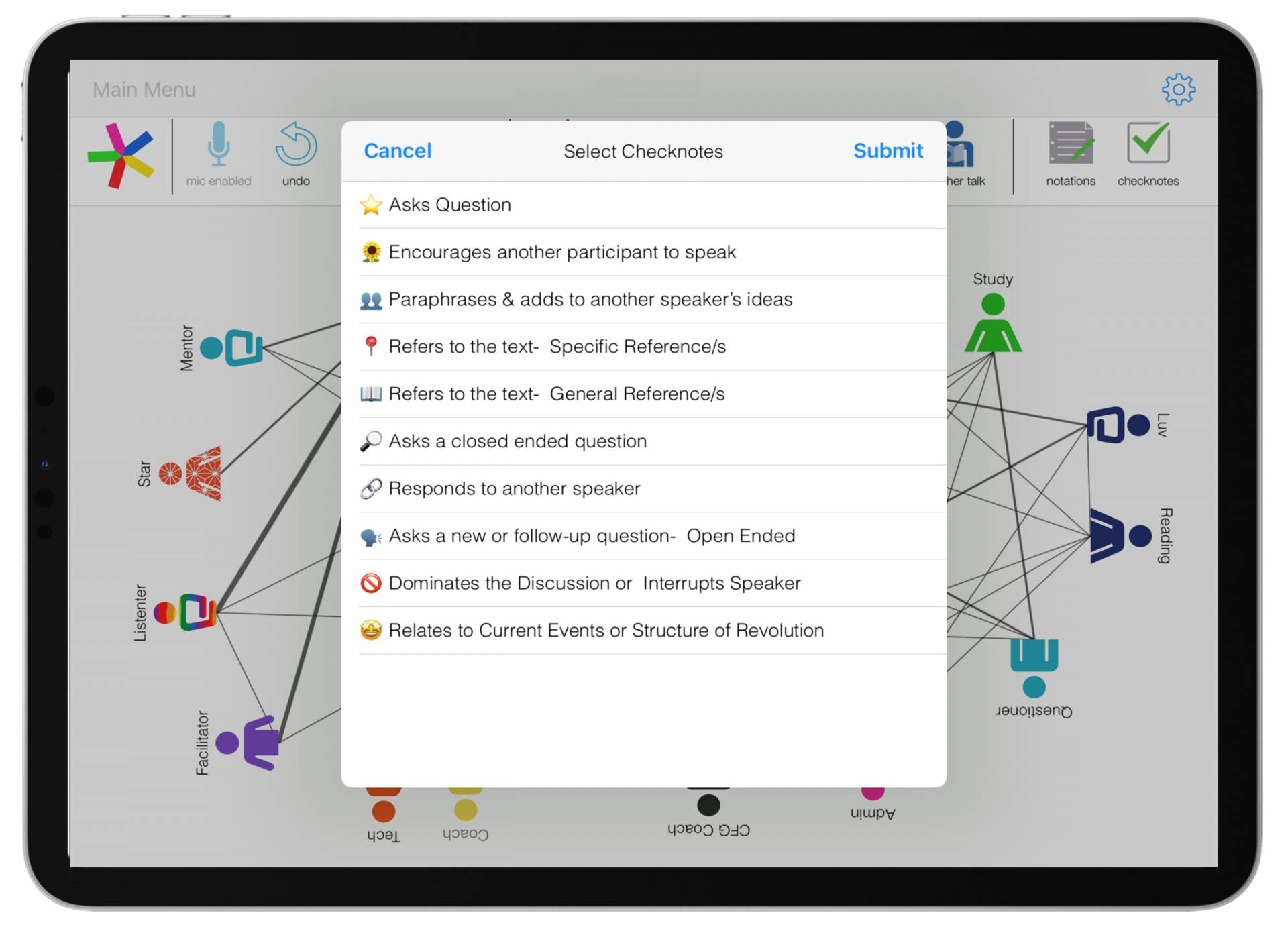
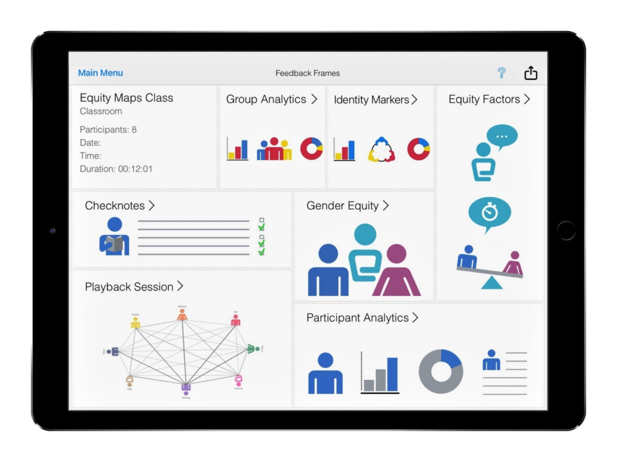
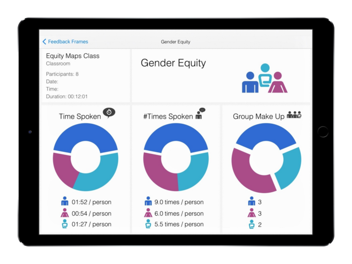
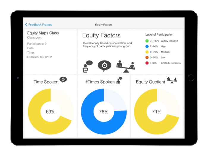
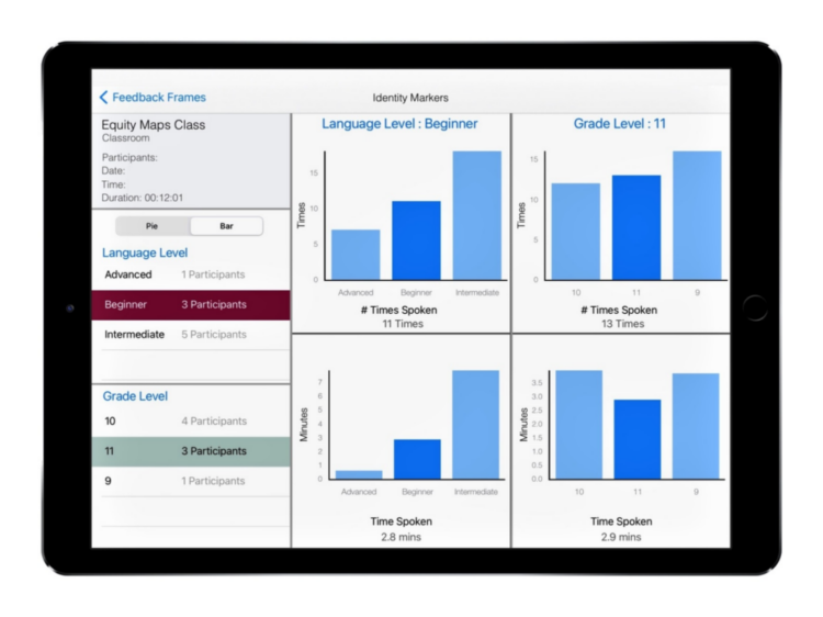
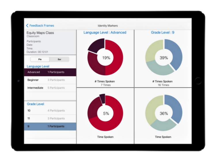
Track types of contributions for groups or individuals
NEW in 6.0 -- Export Reports to Students, Sessions to another Equity Map's user, or Audio !!

We believe . . .
. . . what gets measured and seen can be improved.
. . . learning lasts in classrooms where students feel their voices are heard.
. . . cycles of reflection create deeper learning: listening, efficacy, empathy, and collaboration.
ENGAGE!
Instructional Coaching
Faculty Dialogue
Peer Observations


")
")